A1 Shops
回到项目列表- 位置
- 奥地利
- 年份
- 2014
- 客户
- A1 Telekom Austria Group
- 团队
- Planning: BEHF Architects
The new A1 shop concept developed by BEHF relies on excellent service and flexible product presentation methods
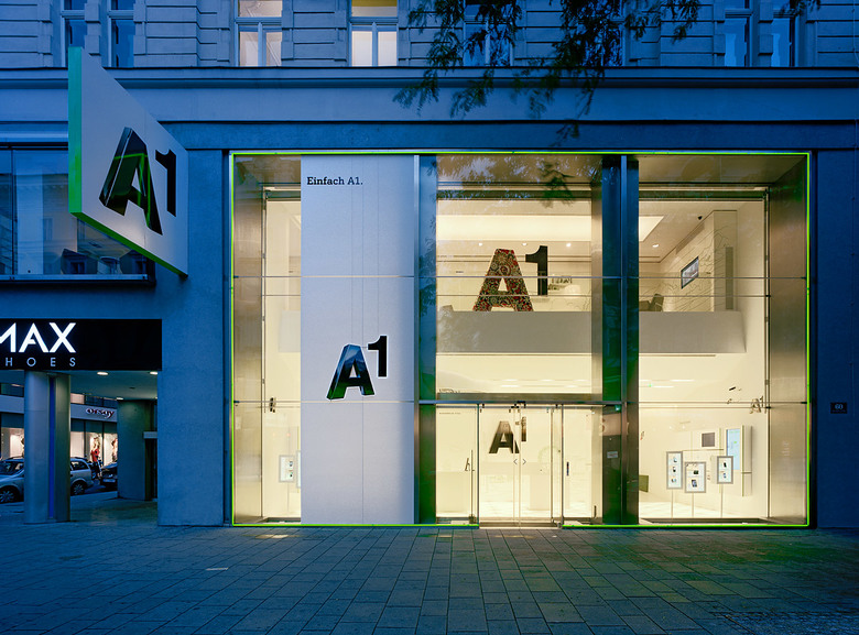
In connection with the merger of mobilkom austria and Telekom Austria in the year 2010, a new shop concept for Austria’s leading telecommunication provider was elaborated. The merger of the two companies has led to a considerable increase in the product range offered inside the shops. In 2011 the company started off with a new brand presentation: the new A1, which can be applied in a flexible way. BEHF Architects developed the shop concept using the logo designs and branding created by Saffron as a starting point. BEHF team has been responsible for the new A1 shop concept since 2005 and therefore has reused many basic elements from areas such as service during the set-up of the new brand presentation. One of the crucial selection criteria was the implementation of the new brand values “simple”, “close to the client & tangible” as well as “trend-setting”.
A meander instead of a queue
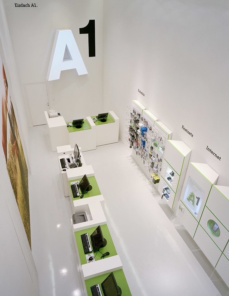
The new concept aims at preserving the high quality and proven good features of the A1 shops and the services provided. What changes is the world of products and new offers, which is centered on the excellent service and consultancy. The meander-shaped desk in the middle has therefore been maintained – as a symbol of unchanged high quality service. The meander-shaped Counter in the middle dissolves the traditional one-dimensional, frontal communication models during consultancy. Consultations and queues are decentralised; the work places of the A1 shop team/the employees are dispersed across the room. This allows for a new definition of the relationship between client and consultant/A1 employee.
Flexible panels for product presentation
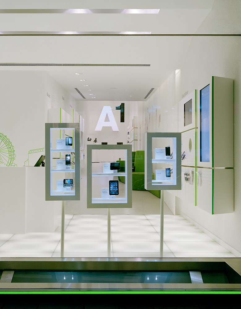
For the presentation of new products and services of the flexible brand, panels were chosen as design elements. These can be assembled in different sizes and forms and allow for different types of presentations and can be adapted to various product sizes. Showcases, attachment elements make it possible to emphasise different levels of significance of the presented items. Highlights can be presented easily and in an impressive way. The dissolution of the usual rigid wall panel is facilitated by varying levels of illumination and a perforated surface (which is illuminated as well).


