House of Communication
München, Germany
- Architects
- HENN
- Location
- Friedenstraße 24, 81671 München, Germany
- Year
- 2022
- Client
- Serviceplan Group SE & Co. KG
- Team
- Joachim Grund, Alexandra Berger, Tanja Dietsch, Andreas Fuchs, Attila Horvath, Katrin Jacobs, Deborah Klajmic, Yvonne Koll, Laura Kummer, Anja Liesenfeld, Christiane Reichenbach, Kathrin Schiffelholz, Gudrun Spitzer, Kathrin Stamm, Peter Weber, Handan Yalki Toyhan, Shiyu Ying
- Architecture
- RKW Architektur+
- Façade
- KAAN Architecten
- Client, architecture
- R&S Immobilienmanagement GmbH
- Special luminaires
- Apropos Licht
- Change management
- Combine Consulting GmbH
- Signage, Serviceplan font, light installation design
- Büro Uebele
- Realization light installation
- Bartenbach
- Building services, construction management
- Drees & Sommer
- Plants
- GKR Hydrokulturen
- Kitchen planning
- IGW Ingenieurgruppe Walter
- Lighting design
- Lumen³
- Media engineering
- OfficeMEDIA visuelle Medientechnik
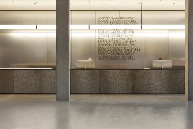
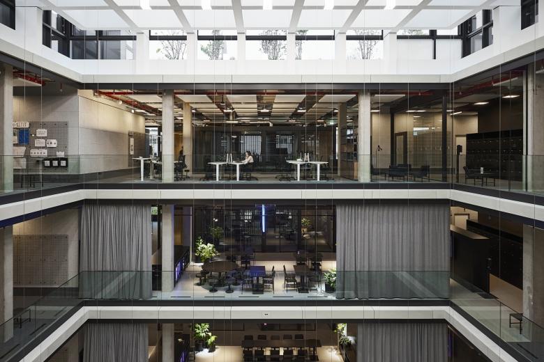
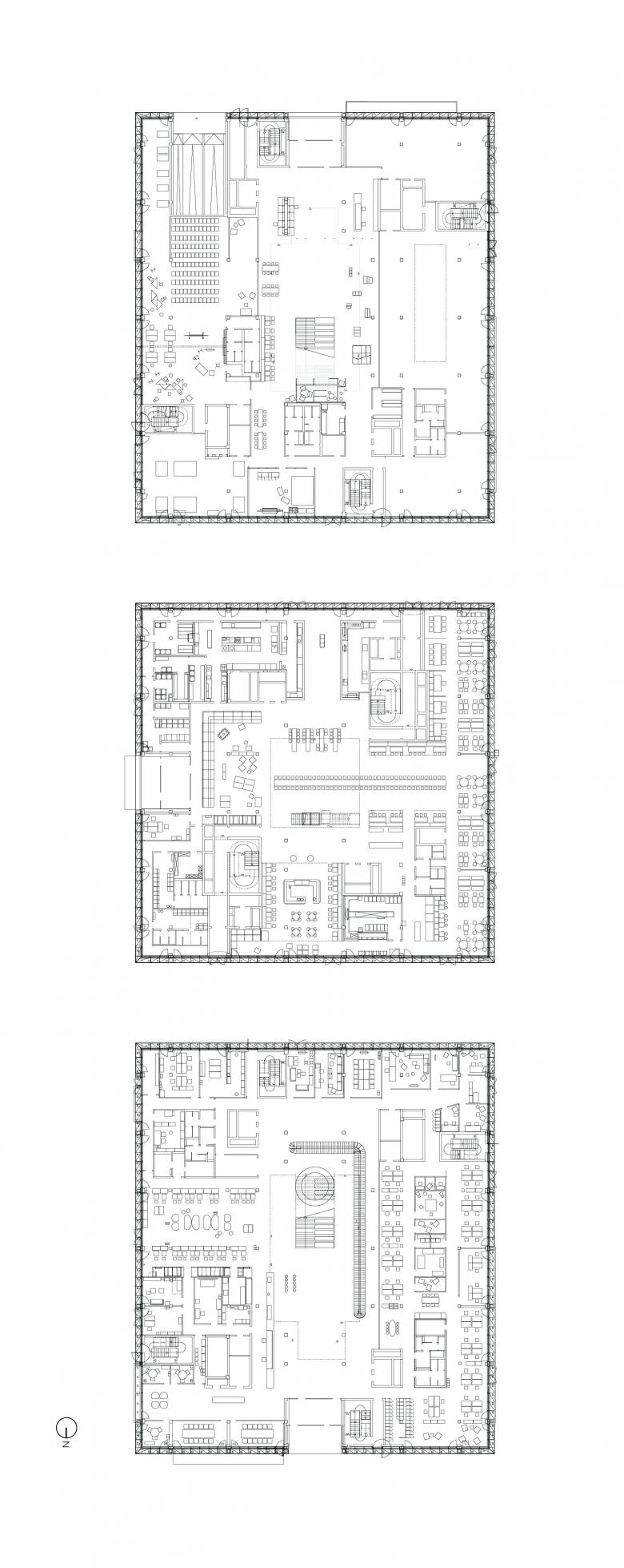
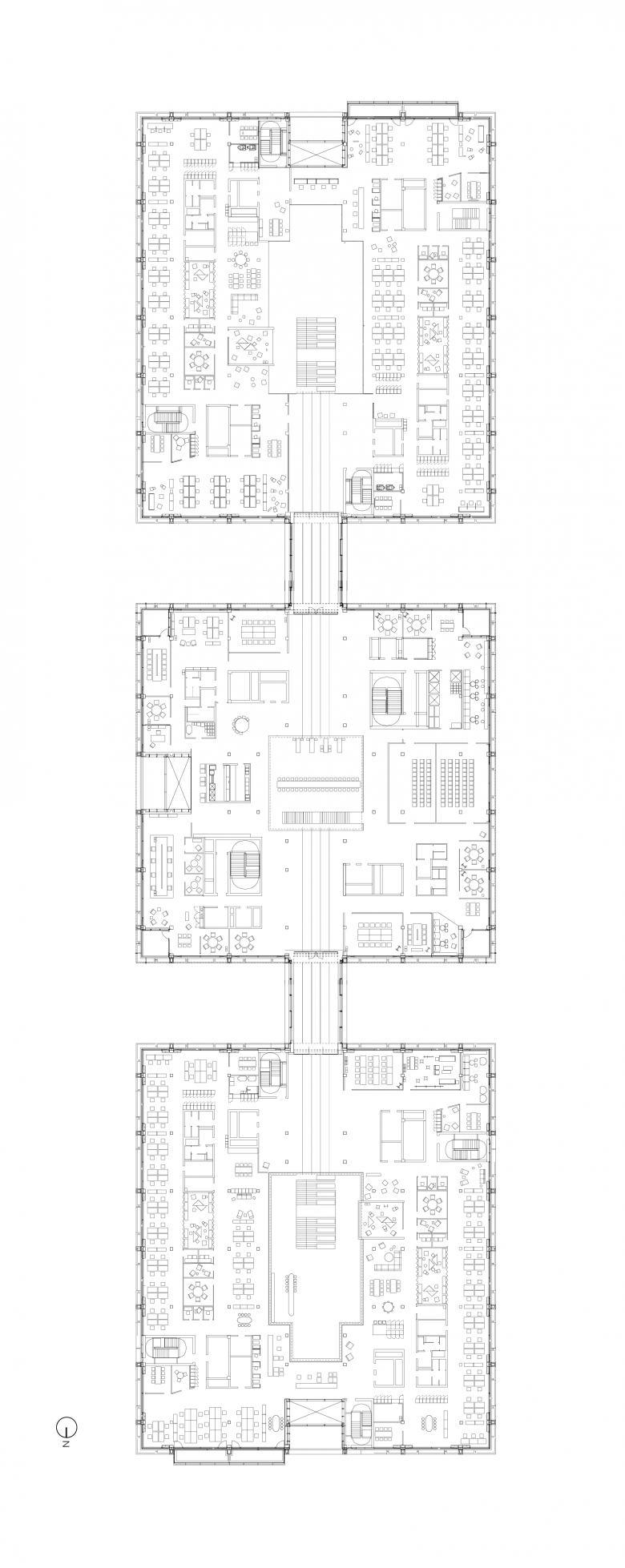
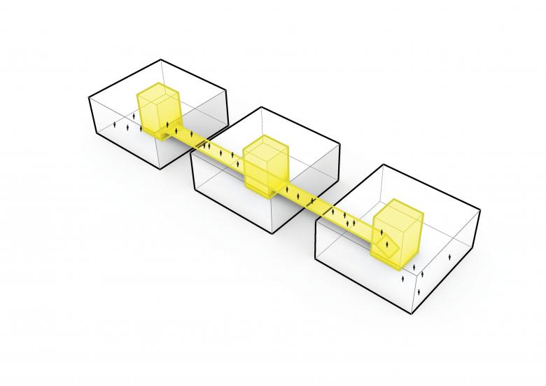
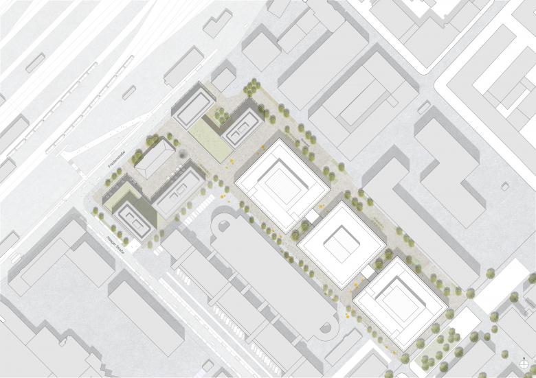
The House of Communication for the Serviceplan Group creates a distinctive spatial identity for the world's largest owner-managed agency group for innovative communication, rooted in the company’s ideals of openness and collaboration. Connecting three separate buildings via bridges, the design concept brings together 40 different agencies and 1,700 employees under one roof on the iCampus, a new innovation district near Munich's Ostbahnhof, developed by R&S Immobilienmanagement. HENN devised the headquarters as a small city, a concept known as office urbanism. Like a city, the House of Communication includes spaces to meet, eat, and relax, alongside meeting rooms and individual work areas.
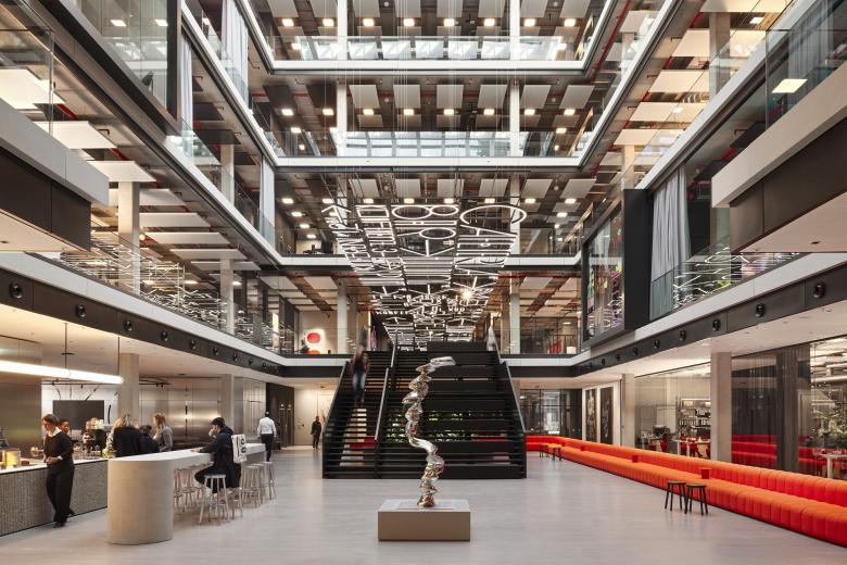
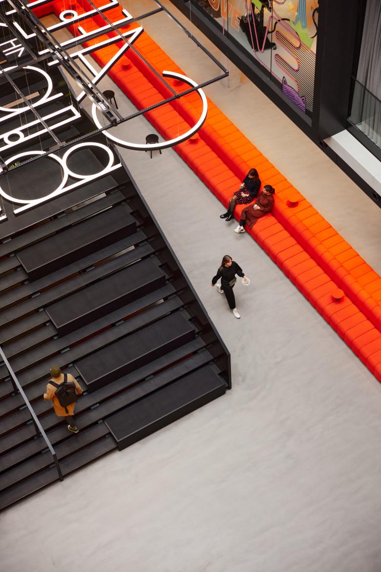
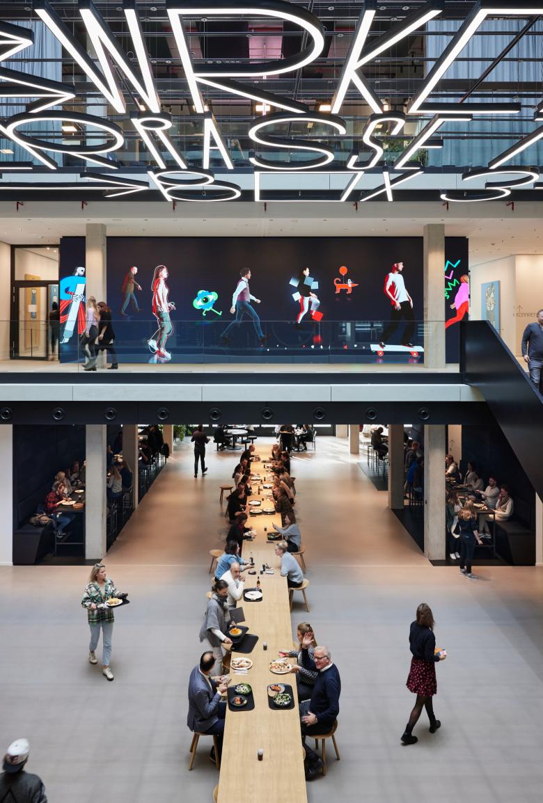
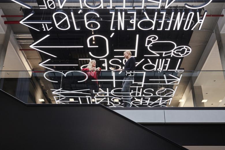
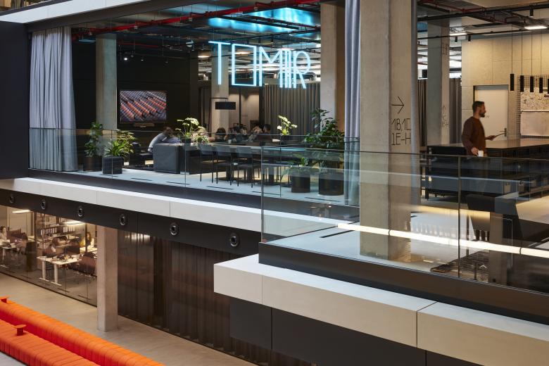
HENN Interior introduced a central axis connecting all three atrium buildings, designed by RKW Architektur+ and KAAN Architecten. The axis and main circulation route, named the Innovation Track, runs throughout the first floor of the entire complex. Visitors enter the Track via a striking six-meter wide staircase at the entrance. The Track’s connective purpose is highlighted by a 130-meter-long light installation, inspired by classic neon signage which had been designed by Büro Uebele. It also serves as an event and exhibition space: pieces from the private art collection of the company owners are on show, including work by Anselm Kiefer, Georg Baselitz and Tony Cragg. With art tours and space for events, the building is opened up to the public.
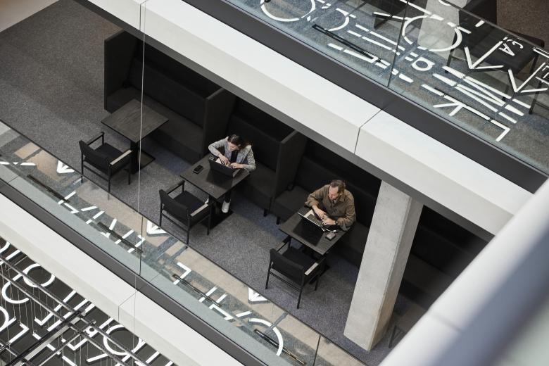
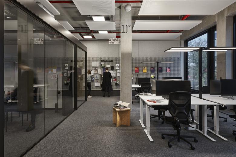
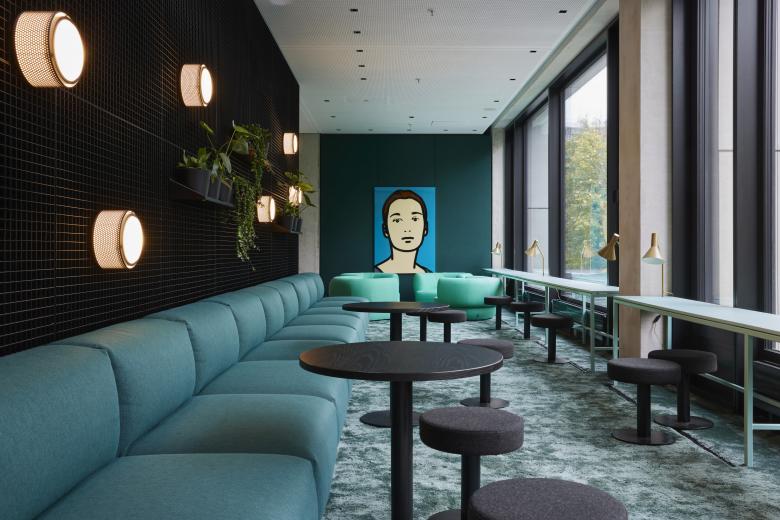
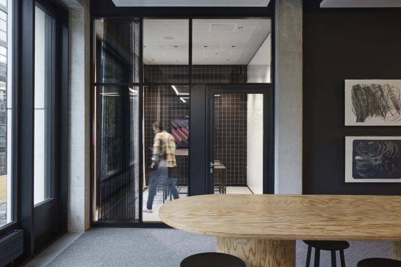
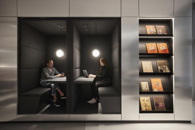
On the office floors, different modes of work – physical and virtual, loud and quiet – can take place in parallel thanks to an acoustic concept that includes sound-absorbing walls, ceiling panels and heavy felt curtains, through to the spatial organization of offices and meeting rooms. The livelier zones are organized around the interior atriums and include spacious tea kitchens and rooms for collaborative work. Around the perimeter, HENN Interior placed quieter areas for focussed work, including telephone boxes and meeting rooms that serve the individual agencies.
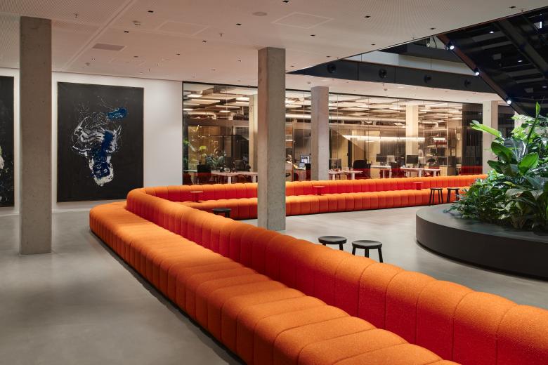
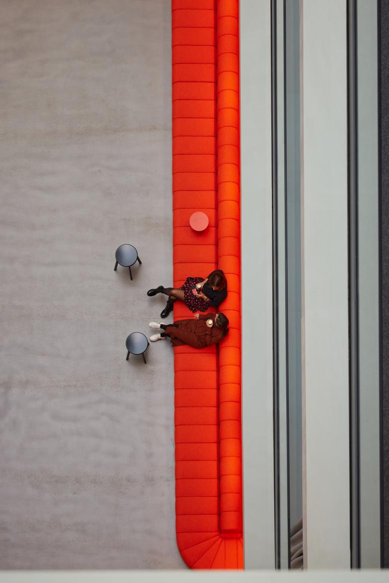
The design follows a distinct visual identity developed for Serviceplan based on the idea of a uniform. Like a well-tailored suit that can be styled with statement pieces and colorful accents, the Serviceplan uniform has clear lines and a monochrome color palette in black, white and gray, creating a coherent whole across all areas and agencies. Coarse industrial materials like steel grating, raw steel and black-stained wood are used throughout. Serviceplan’s ethos of communication and integration is expressed through unique, oversized furniture pieces – there is room for 100 people on a 30-meter-long sofa upholstered in bold, coral Raf Simons fabric, and space for 80 employees at a single wooden table in the canteen. The monochrome backdrop and simple furniture of the Serviceplan uniform allow colorful and oversized statement pieces to pop.
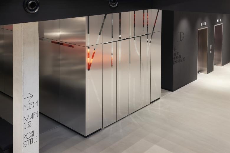
HENN Interiors worked with local manufacturers to develop exclusive elements, including textiles and bespoke lighting pieces. A vintage design piece – a robust and minimalistic chair that was used by Germany’s police departments in the 1950s – was reissued and developed into a whole line of furniture including benches, stools and tables. A custom-built flexible shelving system also serves as a multifunctional room divider. Textile wall coverings with square grids in different colors and sizes are a homage to the geometric architecture of the facade. A special font was developed by Büro Uebele exclusively for the project and used for all signage in the building – for orientation on walls and columns, but also as a typographic element on the Innovation Track, adding visual depth and character.
Related Projects
Magazine
-
Winners of the 5th Simon Architecture Prize
3 days ago
-
2024, The Year in …
4 days ago
-
Raising the (White) Bar
5 days ago
-
Architects Building Laws
1 week ago
