'T Loon Heerlen
Heerlen, Netherlands
For its latest completed project, Powerhouse Company has brought a post-war shopping centre back to life in Heerlen, a city in the southern Netherlands. Commissioned by Dutch real estate investor NSI in 2012 by invited competition, Powerhouse Company has transformed ’t Loon shopping complex into an open and welcoming space to attract visitors. Breaking with the existing mall, Powerhouse Company’s design intertwines a new public square with retail space and a subterranean car park into an architecturally coherent and inviting whole.
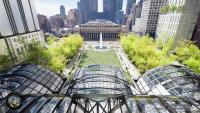
The scheme, which was proposed after a sinkhole caused part of the building to collapse in 2011, is designed around drawing in visitors and creating a lively public realm. It consists of four elements: a new entrance canopy, vertical facade, car park and public square. Sandstone paving, carefully orientated long timber seating and a central planted garden on the new 4,000m2 plaza encourage informal gathering and a place to relax and enjoy good weather. This external area is punched through with openings into the car park below, elevating the driving experience and pouring light into a previously dark and dank space.
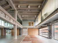
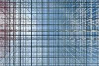
Meanwhile, the new facade is characterised by its transparency and elegant vertical rhythm. The retail space is visible from the square, and the square from the retail space. Lighting designed by Powerhouse Company between the Accoya high-performance timber posts reflects on the golden aluminium window sidings to give the building a calming glowing hue at night. A rounded corner on the right side of the facade softens the classical composition and straight lines of the facade, and guides pedestrians towards the entrance of the shopping centre. The entrance, connecting the retained 1960s building and the renovation, is a double-height space distinguished by its slender white aluminium and steel floating external canopy. Inside, the retail space, currently occupied by C&A, is designed to accommodate changing uses and circumstances over time. A large void providing natural daylighting has the potential to be filled for future internal expansion.
Located on a sensitive geographical site which saw shallow mining until the 1950s, the building has been designed to withstand further potential ground movements. The car park is constructed from massive structural concrete beams that work as a bridge crossing the plot. Powerhouse Company's renovation has secured and updated the shopping centre for it to prosper again long into the future.
- Architects
- Powerhouse Company
- Location
- Heerlen, Netherlands
- Year
- 2015
- Client
- NSI
- Timescales
- 2012 – 2015
- Collaboration
- Philip Vencken, Architecten aan de Maas
- Area
- 10,000m² (total); 1,500m² (retail), 4,000m² (square), 4,500m² (car park)
- Partner in charge
- Nanne de Ru
- Project leader
- Paul Stavert
- Team
- Stefan Prins, Nanne de Ru, Ard-Jan Lootens
- Structural Engineering
- IMD Raadgevende Ingenieurs
- Contractor
- LAUDY Bouw & Ontwikkeling


