Hall of the Sun Public Space Interior Design
Shanghai, China
- Architekci
- LUKSTUDIO
- Location
- No. 181 Rui Hong Road, Hong Kou District, 200086 Shanghai, China
- Year
- 2021
- Client
- Rui Hong Xin Cheng
- Team
- Christina Luk, Yicheng Zhang, Haixin Wang, Edoardo Nieri, Dong Wu, Charis Nicolaou, Kevin Yang, Wendy Zhang, Jimmy Zhu, Weifeng Yu, Xiaojian Yan, Sarah Wang
- Principal Architect
- Arquitectonica
- Structural Consultant
- Arup International Consultants (Shanghai) Co., Ltd
- M&E Consultant
- Parsons Brinckerhoff Engineering Technology (Beijing) Co., Ltd. Shanghai Branch
- Lighting Consultant
- Lighting Planners Associates
- Lighting Development
- Shanghai Tongji Interior Design Engineering Company
- Landscape Consultant
- Design Land Collaborative
- VI Consultant
- Dutton Bray Design Limited
- General Contractor
- China Construction Third Engineering Bureau Group Co., Ltd
- Photography
- Peter Dixie, Yui Zhang
- Post-Processing
- Eagle Impression
Located in the North Bund of Hongkou District, Hall of the Sun is a 180,000 square meter commercial hub with an emphasis of nature in the design, including its curvilinear facade and a 3-storey-high biophilic food hall under Shanghai’s largest skylight roof canopy. Informed by the organic architecture, Lukstudio has extended the concept of nature and vitality into the public interior spaces.
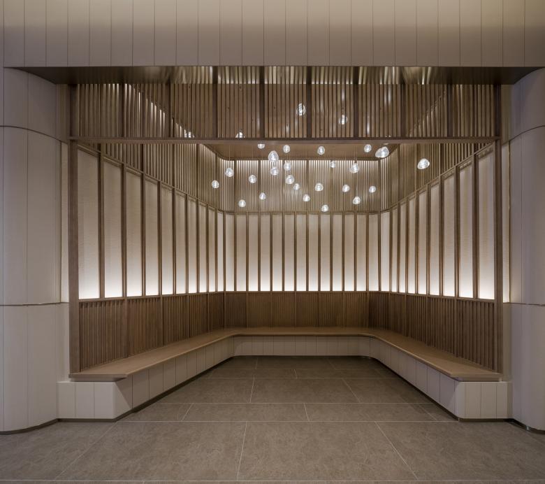
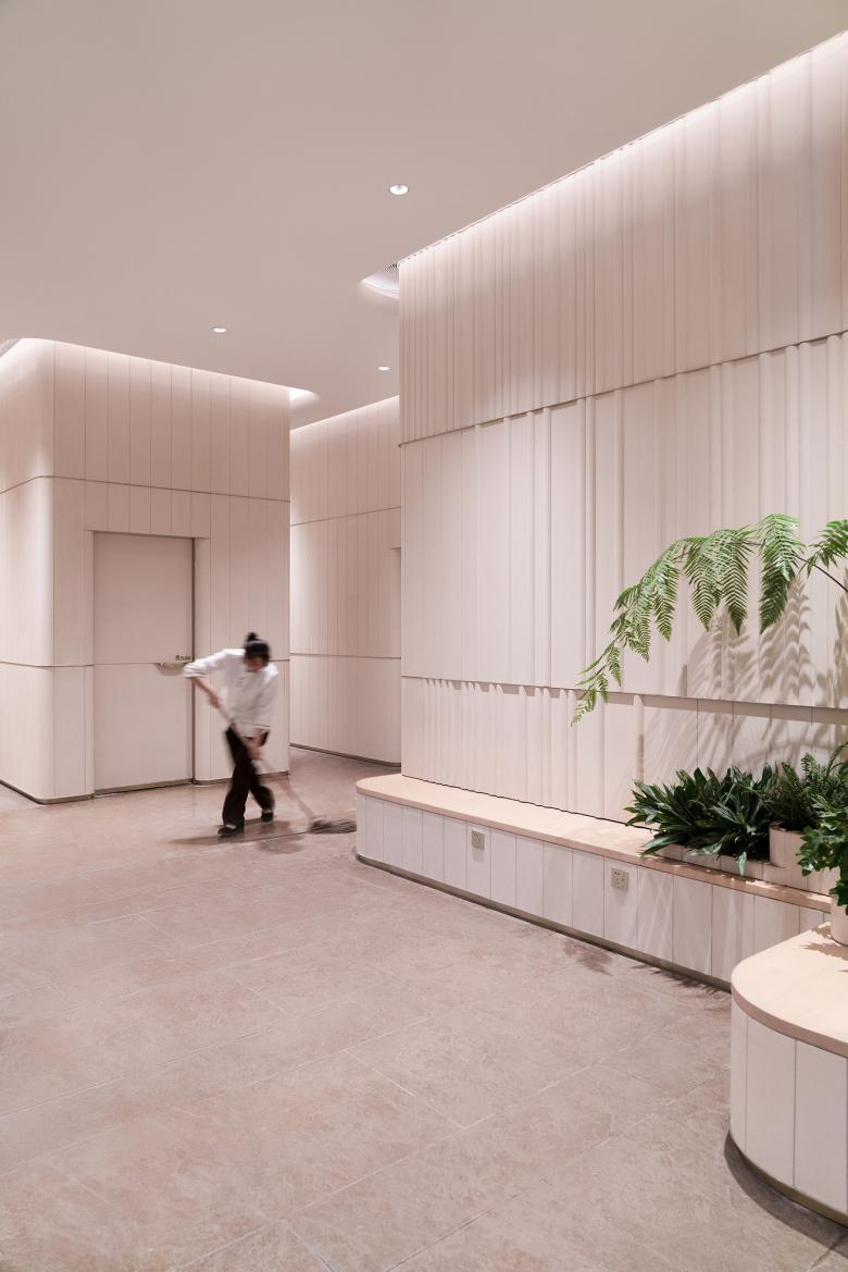
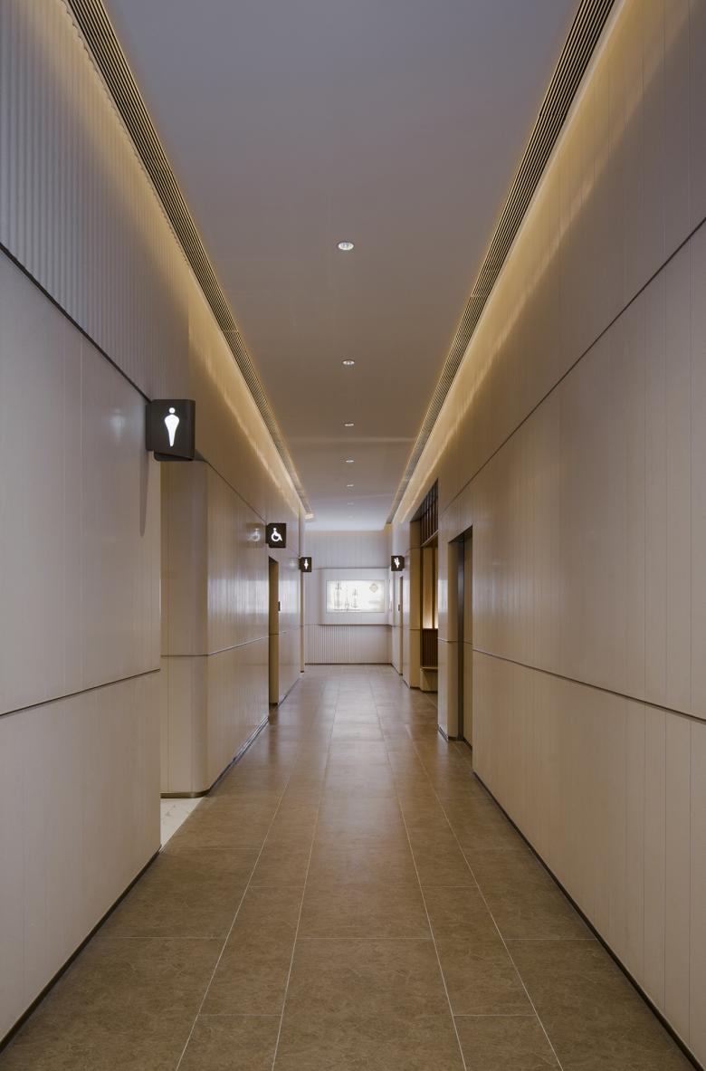
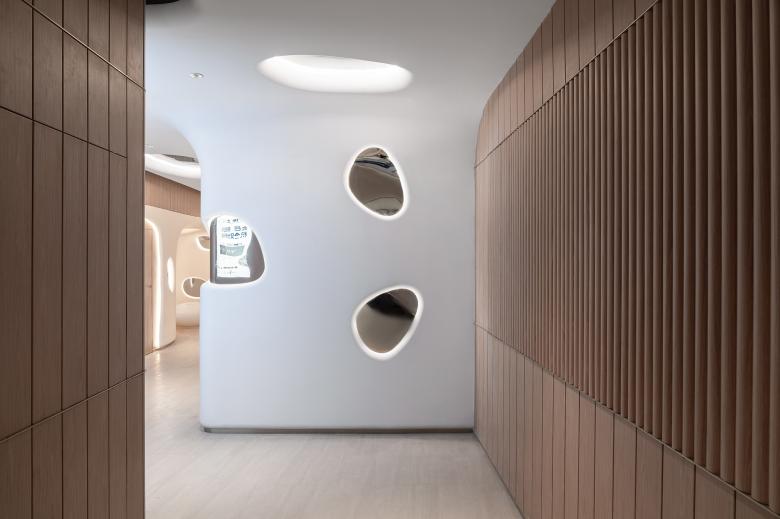
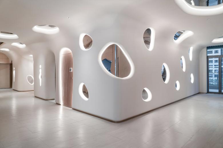
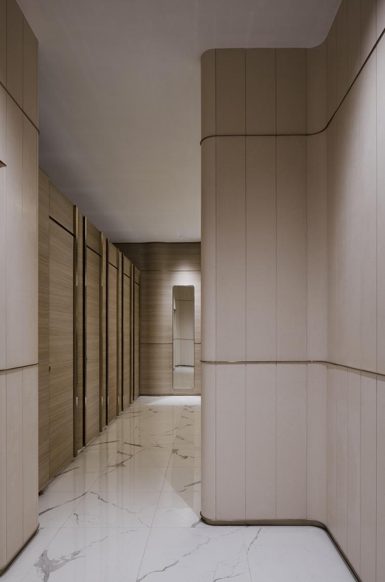
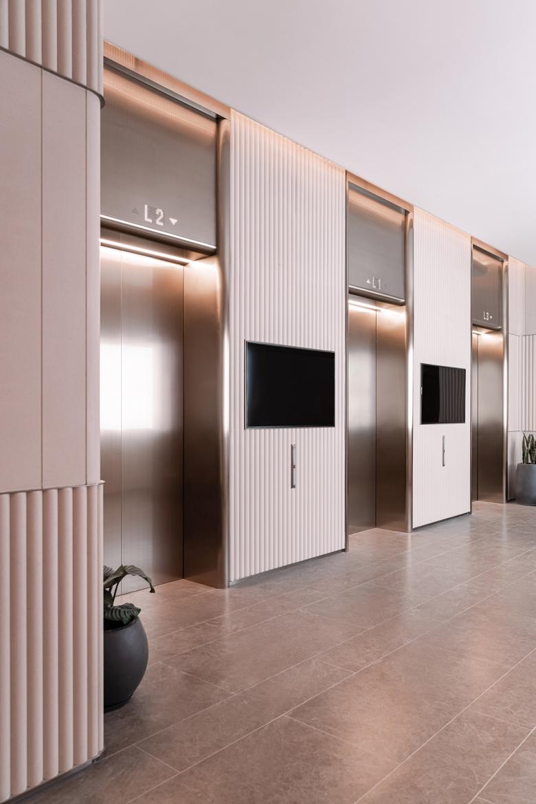
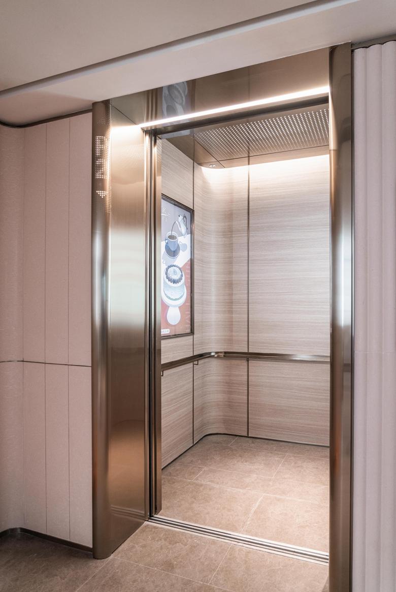
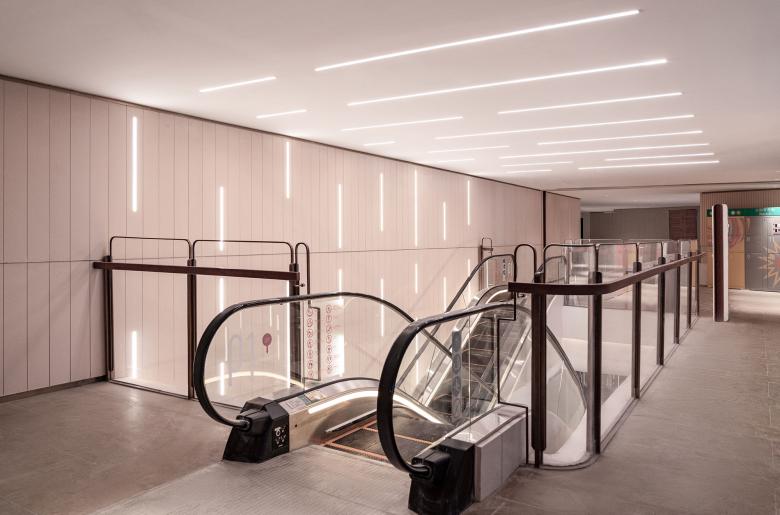
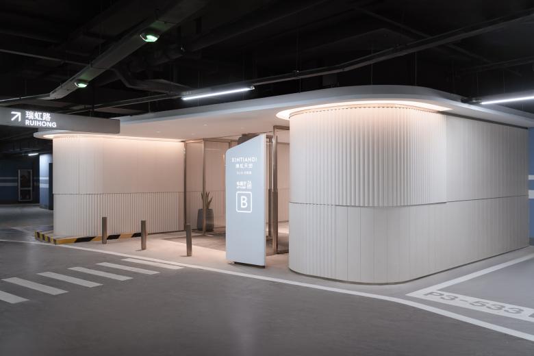
The scope includes all the elevator lobbies, elevator interiors, corridors and washrooms from Level B4 to L4. With the design intent of creating artificial “caves” , our enthusiastic team experimented a handful of remarkable proposals with various materiality, layers and forms in the concept stage.
The quest of fulfilling “timeless elegance”, “easy maintenance” and “cost effectiveness” in a circulation space challenged us to turn away from the popular approach of creating narrative and character in a commercial space, perhaps a design habit nurtured by the contemporary fast consumption and social media culture. In this exercise, Lukstudio returns to the basics of architecture, embracing “less is more” to pursue order and balance.
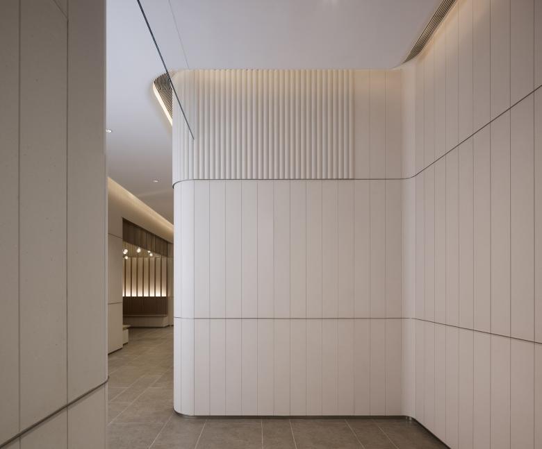
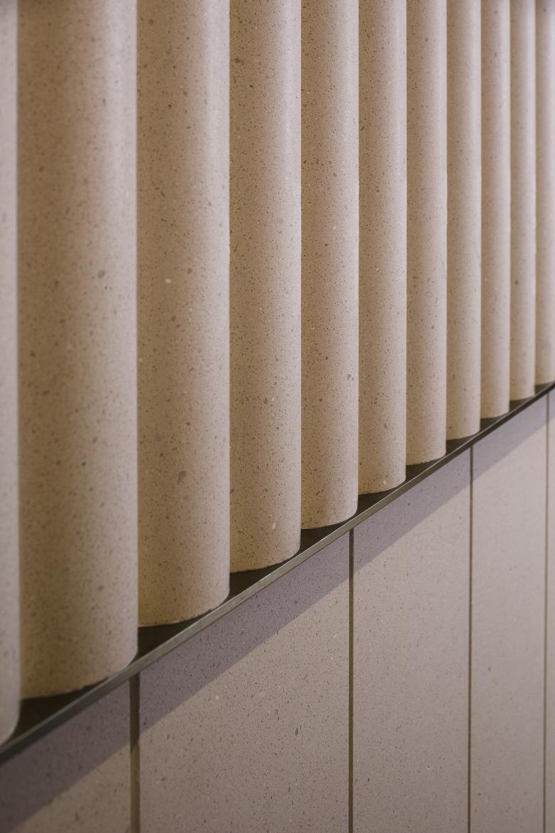
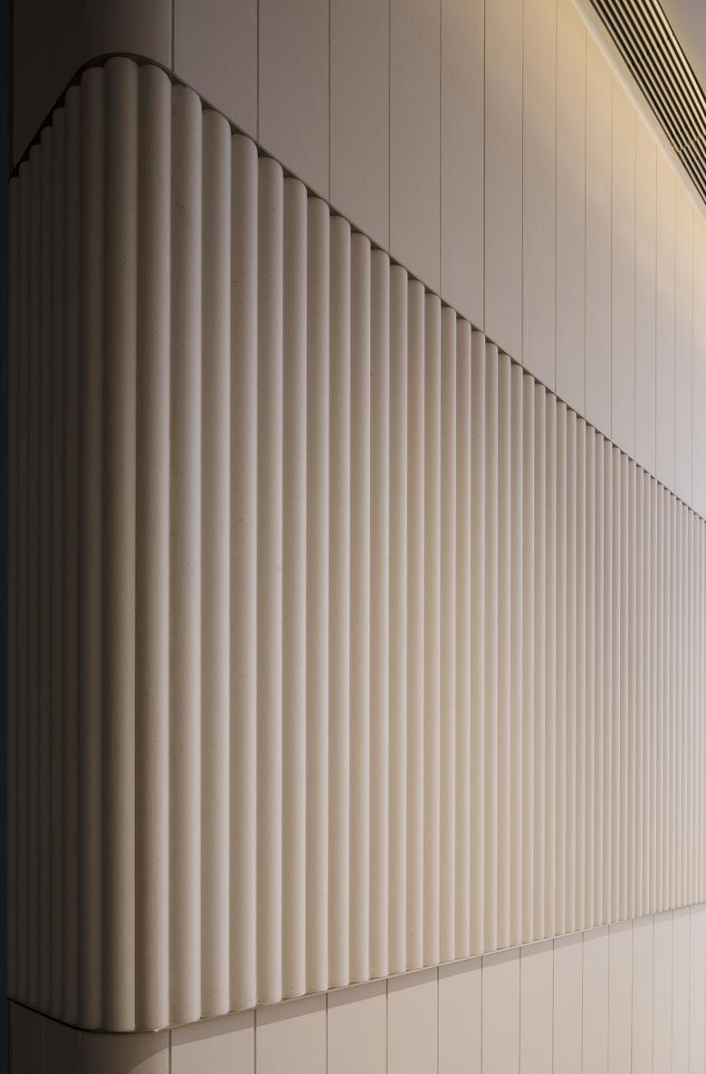
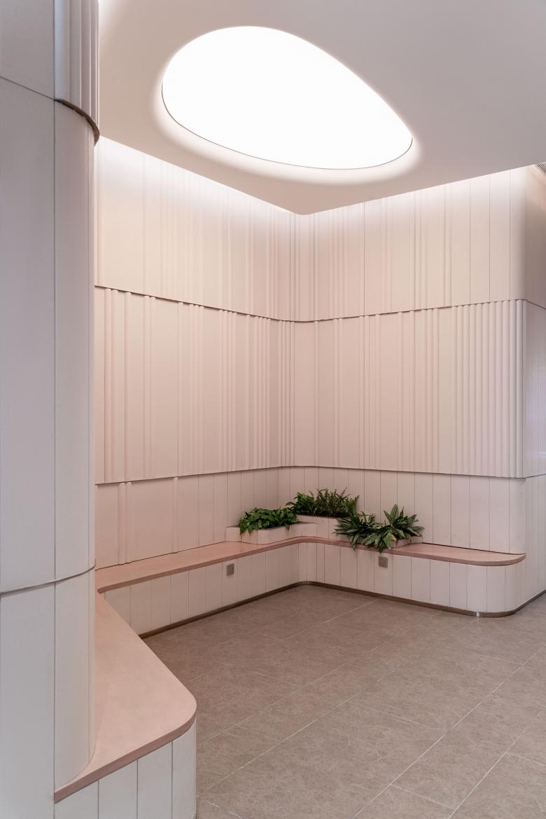
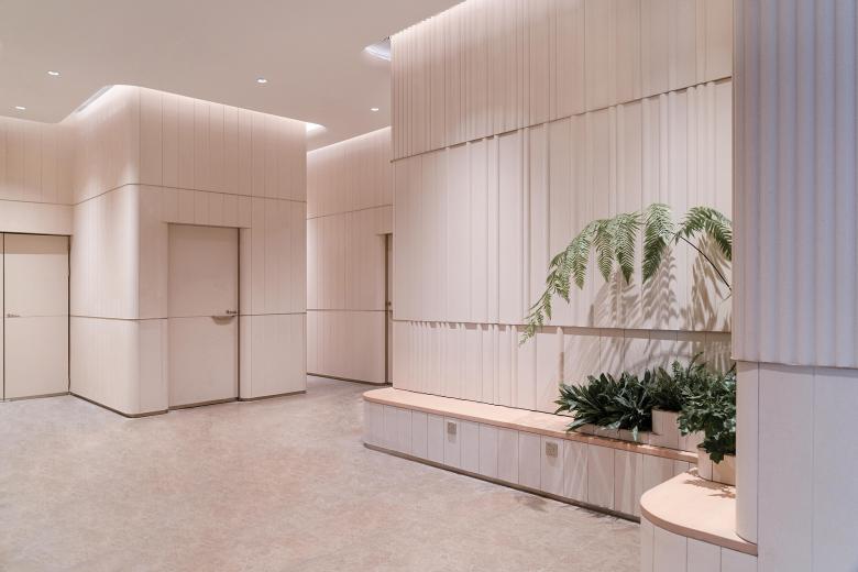
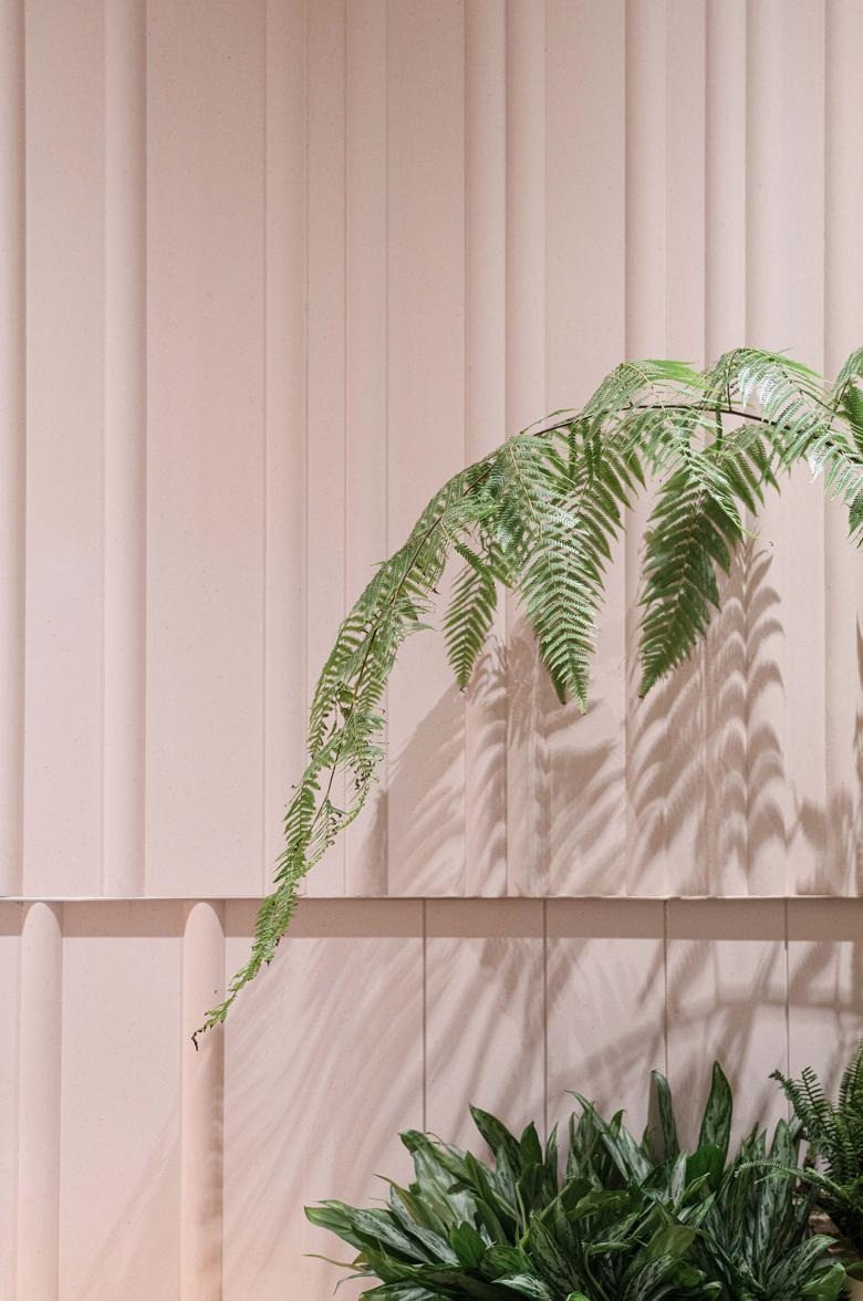
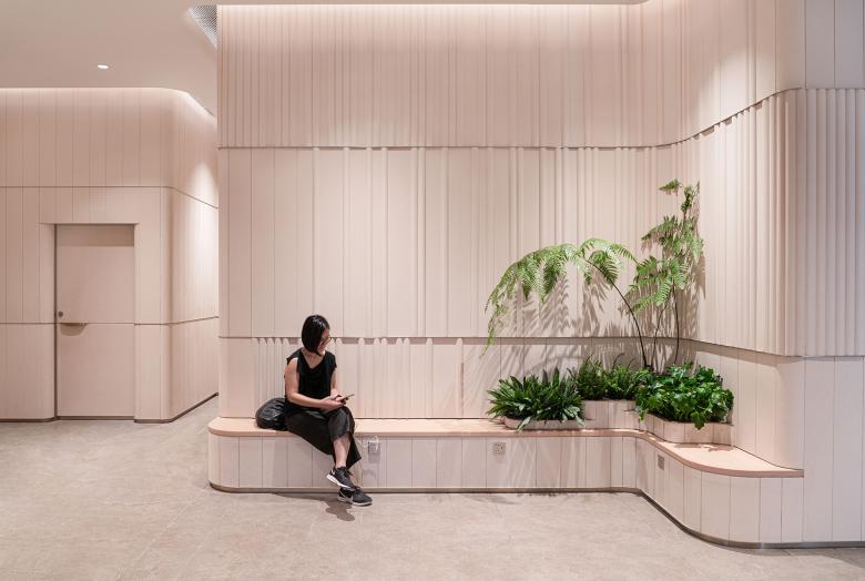
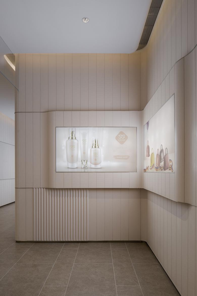
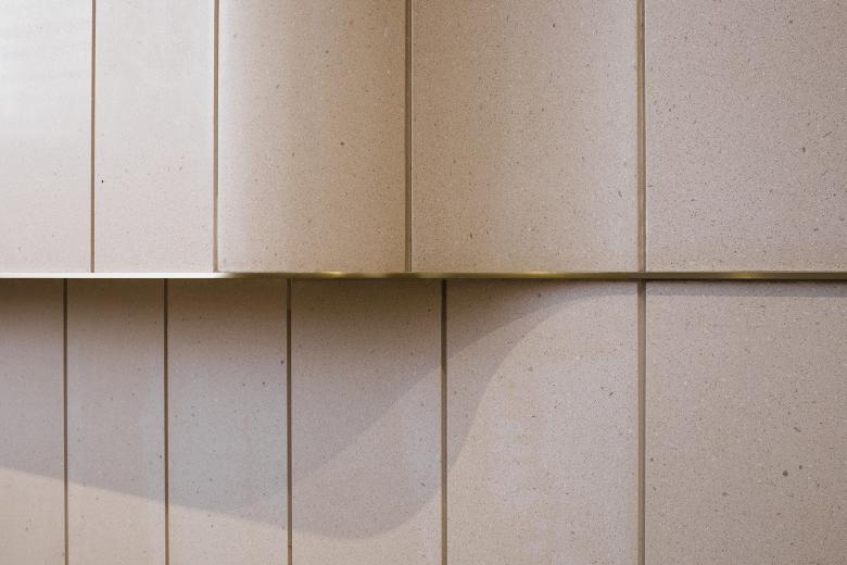
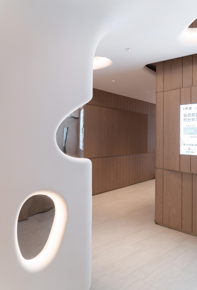
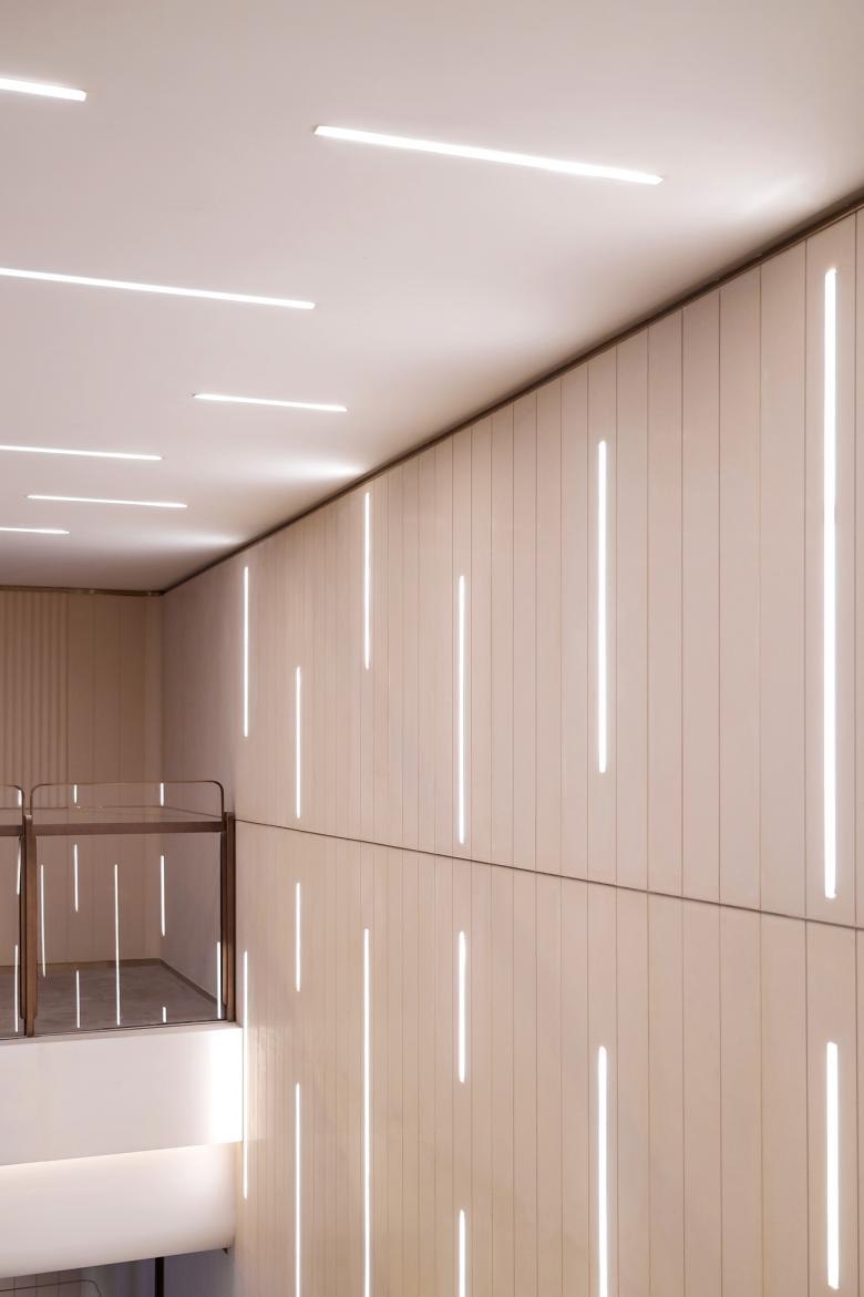
The public areas are distributed near the atrium and the northwest corner of each floor where the washrooms are located. The walls from LG to L2 are lined of vertically arrayed limestones stratified into 3 bands. The texture change between reeded and flat panels is highlighted by brass plate details.
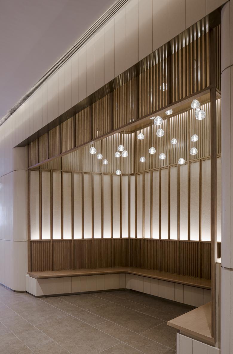
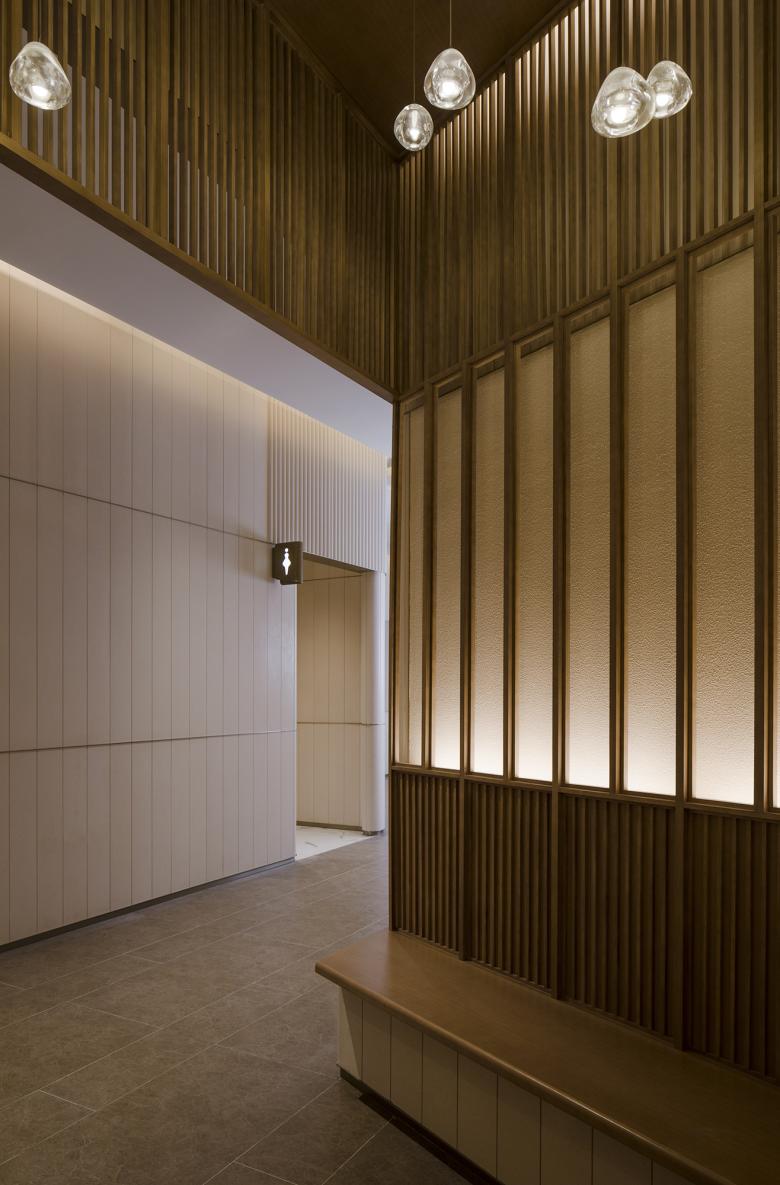
At the waiting nook, Lukstudio originally proposed a tea-house inspired wooden pavilion to complement the streamlined cave. We imagined this delicate spot would be treasured by those who needs a pause from the stimulating shopping or working environment.
After the mock-up phase, a more minimal approach was requested. The final design continues with the homogenous stone backdrop with dancing reeded tiles.
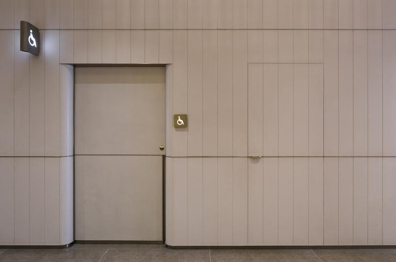
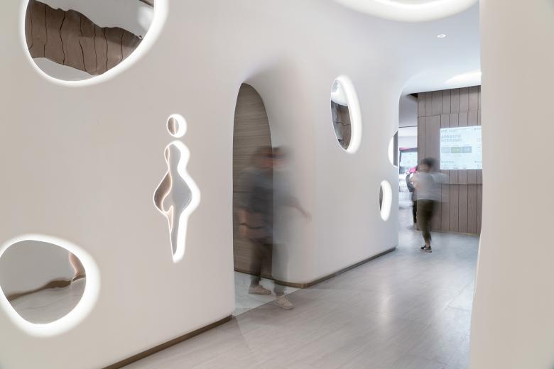
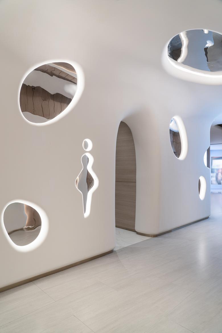
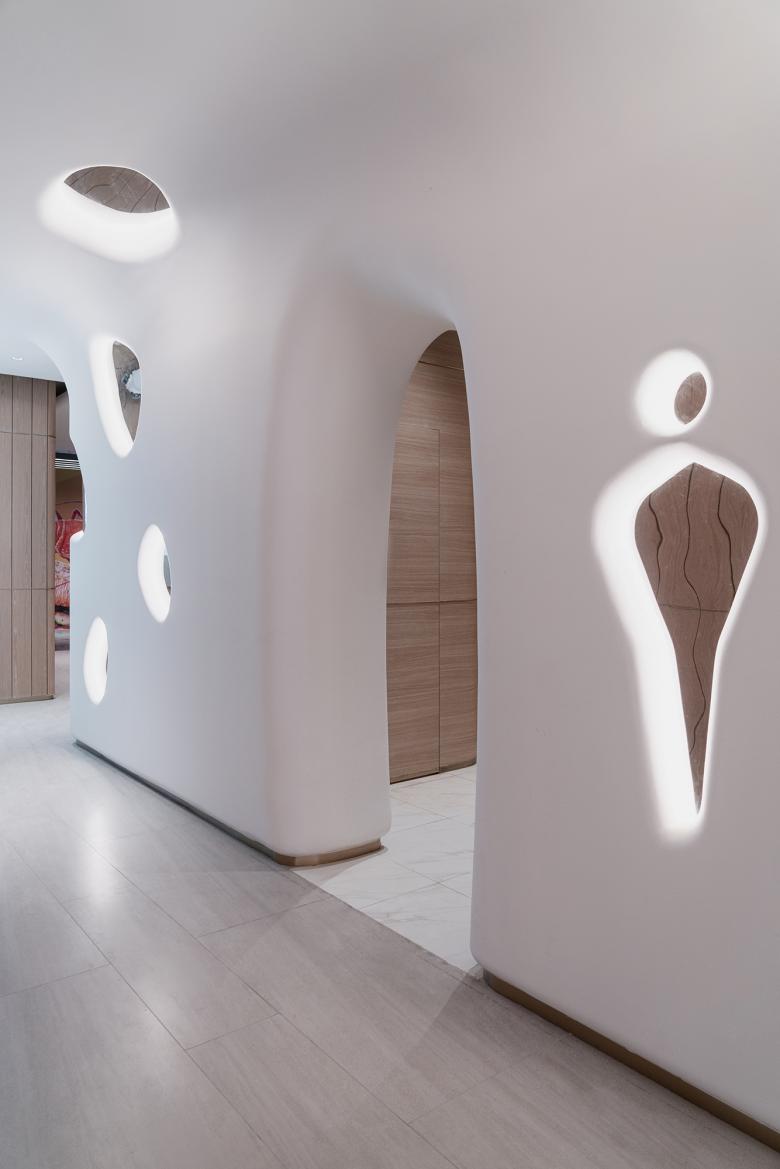
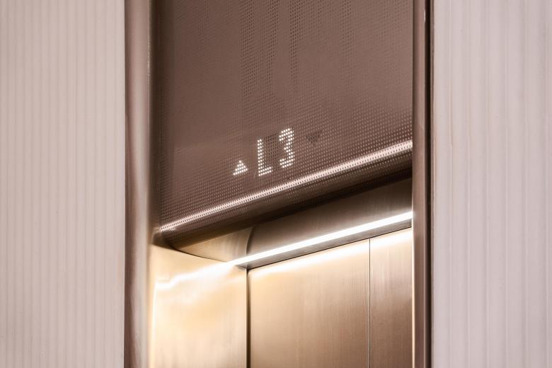
The overall soothing ambience is achieved with curvilinear details seamlessly integrating the functional items such as doors, handles, signage and advertisement screens. Cove lighting at the ceiling is also softened by the rounded edge construction.
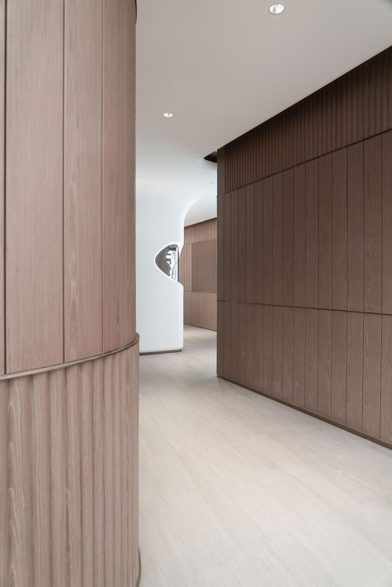
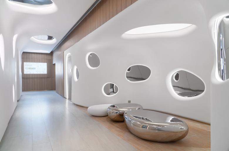
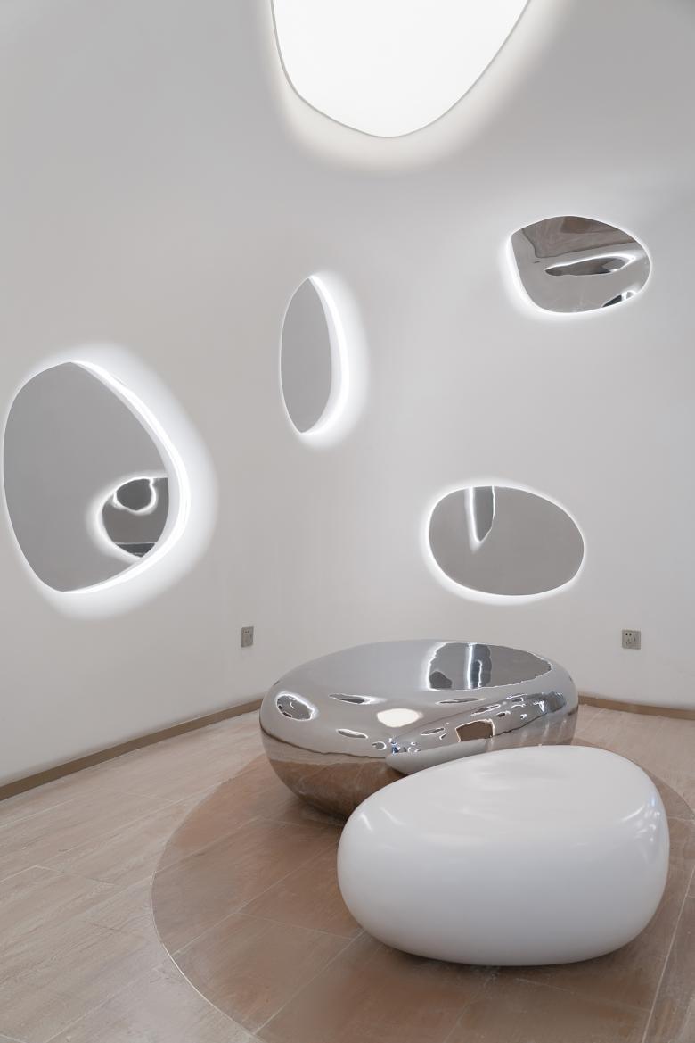
To better reflect the retail mix of L3-L4 focusing on kids, sports and electronics, a more dynamic and playful cave is envisioned as a surprise. Darker wood veneered wall echoes the effects of limestone, then hidden within a white futuristic cave made of Glass Reinforced Gypsum (GRG) is dotted with potholes of mirrored stainless steel. Super-sized pebble benches of different finishes serve as sculptural seating.
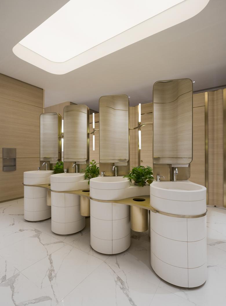
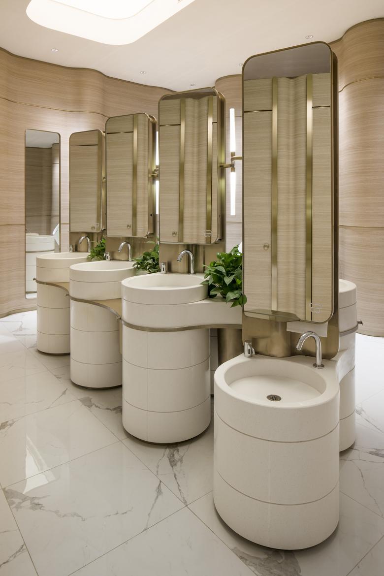
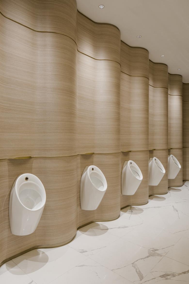
In the washroom, organic forms are as sculptural as they are functional. The washbasins are conceived as stone pillars stacked by interlocking layers and interspersed with brass components. The intricate central piece has integrated mirrors, decorative light fixtures, waste bins, paper towel holders, hangers as well as small planters. Replacing traditional baffles in male washroom, an undulated wall carves out just enough visual separation between the urinals. The gentle experience is finessed with thoughtful phone-holders spanning from a transitional brass strip.
“Though we tend to believe, in architecture as in literature, that an important work should be complicated, many appealing buildings are surprisingly simple, even repetitive in their designs.”– Alain de Botton, The Architecture of Happiness
For a period of 3 years, Lukstudio has honed a skillset working with many parties to refine humble spaces in an ever-changing commercial environment. We believe that simple user-centric spaces bring small pleasure in the everyday. We hope our endless efforts would last in the physical world and serve the public realm.
Related Projects
Magazine
-
Winners of the 5th Simon Architecture Prize
1 week ago
-
2024, The Year in …
1 week ago
-
Raising the (White) Bar
1 week ago
-
Architects Building Laws
1 week ago
