Breo R&D Office and Future Experience Hall, Shenzhen
Project name: Breo R&D Office and Future Experience Hall, Shenzhen
Area: 1,000 square meters
Construction phase: June 18, 2021 - August 20, 2021
Client: Breo
Design firm: Onexn Architectural & Spatial Design Office (Shenzhen) Co., Ltd.
Website: http://www.onexn.com/
Chief designer: Wang Jingjing
Design team: Zhang Yongbin, He Ziying, Guo Yanxin, Ye Runze
Photography: Kelvin
Construction team: Yao Weihong
Lighting design: PUDI
Office furniture: SIMPLE
Artist and writer Jiang Xun once said, "Solitude means being with oneself."
In today's rapidly evolving cities, an isolated island is formed in everyone's heart. While the material world outside it expands, the unprecedented evolution of time and space has obscured the needs of the spiritual world inside.
Luckily, as more and more companies become aware of the causes behind this phenomenon, they become no longer mere merchants selling products in the traditional sense, but pioneers exploring the new consumer era. The Chinese word for business "Sheng Yi" can be interpreted as "the meaning of life". Where there is an emphasis, there will be success.
Breo is one such company. For this project, Onexn Architects and Breo explored the "meaning of life" through the medium of design.
Located in Fenda Technology Park, Shenzhen, the project is Breo's R&D office established by its production technology department, to provide high-quality services in the process of brand reproduction and technology reengineering. This new workspace, designed by Onexn Architects, is intended to convey the company's values of doing the right things and the corporate philosophy of putting people at the center of technology.
The inspiration for this project came mostly from the business philosophy of the company's founder and president Ma Heting. At the early design stage, the design team studied the brand and its underlying business philosophy - respect for the Way, virtue and righteousness, which is extracted from the ideas of ancient Chinese philosopher Wang Yangming.
Based on the concepts of the brand and its products, Onexn Architects figured out the functional demands of the space. The team extracted four key words, i.e. efficiency, simplicity, lightness and connection, to interpret the functional layout of the space and its forms.
The project is located on the upper floor of a tower building in Fenda Technology Park. The design team set the open office area at a position with the optimal view and daylighting conditions, so that the quality resources can be shared by all employees, reflecting the corporate values of fairness and equality. In the middle of the open office area, a core functional area is set up, which serves as a functional transition and separates the dynamic and the static.
The spatial sequence is formed by "blocks", which transforms from two-dimensional to three-dimensional and eventually generates several functional "boxes".
Leave a space for thoughts
In the Design Brief, the client didn't require product display and experience areas. However, as this project acts as a product R&D office, it will surely host many customers and companies. After thorough consideration and functional organization, and with the consent of the client, the design team added a product display area and an independent experience area in the limited space. Those two areas are combined with the public space to satisfy the needs of product display, to establish a bridge between the customers and the company, and to convey the values of the brand.
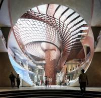
The product experience hall, called the "future experience hall", is the most unique design highlight of this project. The designers hoped to convey the spirit of human exploring the unknown through the incorporation of "light", which symbolizes the way Breo explores the future of human wellbeing through technology. The product experience hall is an independent space with all six surfaces finished with concrete, signifying the company's brand concept of returning to the essence and simplicity. The middle wall is equipped with a flat light hole, resembling a window to the future of the universe and a metaphor for mankind's fearless exploration of technological civilization.
Visitors to this immersive space can feel the peace and tranquility that Breo, as a technology company in the wellness industry, hopes to convey.
The essence of space - boundless experience
The original space was very neat, featuring a symmetrical pattern along the central axis. The design team cleverly introduced the spiritual experience of traditional Chinese gardens into the space. Along the central axis, each functional space is placed in order and in harmony with the regular plane. Interspersed with multiple spatial nodes, the space presents the imagery of gardens and creates a progressive sequence.
The orientation of the space restricts daylighting, but also inspires new ideas. The design subtly links up the spaces through a twisting circulation, and allows light to penetrate throughout. The entire core public area in the middle forms a flowing spatial layout, offering users a "boundless" spatial experience of returning to the essence.
The black, white, and gray tones, along with the wood texture, create a sense of sophistication, while the rhythm of the dark lines on top of the rectangular blocks makes the transition of the space attractive and enchanting for further exploration.
The circulation loop formed by the functional division clearly shapes the spatial pattern, while implicitly guiding the sight line and evoking behaviors and emotions. The architectural space, the transition of elements and the intentional restraint of circulation shaped by the blocks, all serve this purpose.
The concrete screen walls in the product display area interpenetrate, and are set back and carved out with holes, creating a simplistic spatial status. The minimalist modern style is integrated with an intimate natural atmosphere, redefining the relationship between human, city and nature.
The open product display hall is set on the core circulation route, next to the "future experience hall". The carved-out openings on its walls enhance visual interaction, while strengthening its connection with neighboring spaces.
Large windows in the open office area enhance the interaction between the interior and outside. The original ceiling structures are deliberately exposed. All spatial scenes center on serving working and display functions. Architectural languages are adopted to deconstruct and recombine the space.
Boundless - guidance of light
The space is fluid. The movement to the other side of each square hole is guided by light. This is a metaphor, implying R&D personnel's exploration of the underlying logic of things in the universe.
Light and space interpenetrate each other, breaking through the physical boundary and creating an infinite realm in mind.
Plants and light
The reception and communication areas on the west side of the front desk adopt transparent glazing as partitions, which ensure unblocked sight line and strengthen spatial connection visually. The overhanging structure, the veranda-like passage and the transparent walls form a scene that echoes traditional Chinese gardens, and enrich the visual effects of landscapes.
Featuring an outdoor garden-like cozy ambience, this transitional area blurs the boundary between the interior and outside. The complete form of the interior space and the concrete-texture wall finishes further strengthen the idea of blurring interior and exterior boundaries.
Epilogue
Through conceiving this workplace for Breo, Onexn Architects intended to convey the brand's values, and to highlight is spirit and attitude. The design team combined both transparent and elements in the space, incorporated the brand's philosophy into the space through design approaches, and created dramatic spatial experience by guiding sight lines in various manners.
The space shifts from the dynamic to the static, and realizes the symbiosis of privacy and openness. Each functional area is independent yet integrates with each other. The design not only solves practical problems, but more importantly centers on the needs of users.


