Lines
Shanghai, China
- arkkitehdit
- SAKO Architects
- Location
- Shanghai, China
- Year
- 2022
- Client
- 中华企业股份有限公司
- Team
- Principal architect: Keiichiro Sako
- Interior Design
- SAKO Architects
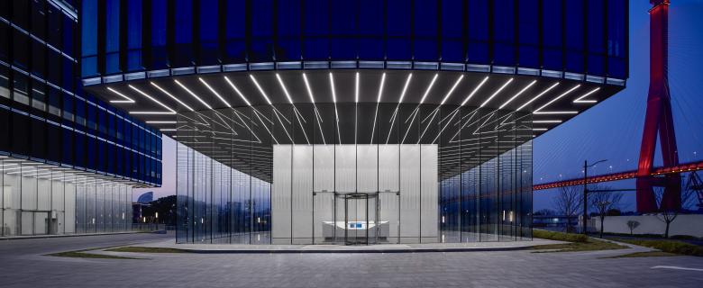
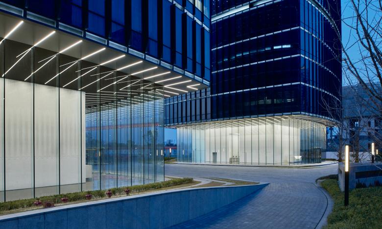
This 10-story twin tower on the banks of the Huangpu River in Shanghai is a clear-cut center-core office building. The cantilevered structure extends 9.7 meters from the center core to the curtain wall exterior, and the glass exterior of the entrance hall is set back 3 meters from the perimeter wall.
As an interior designer, the goal was to draw out the architectural features of the building and emphasize them further in the design.
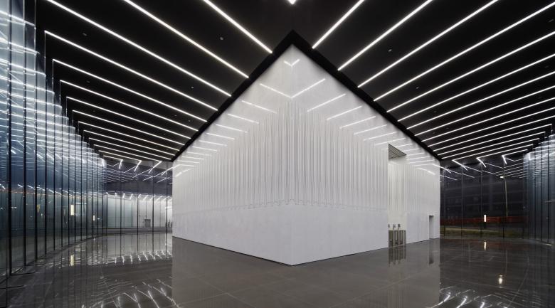
The first image that came to mind is a simple visual representation of a "small box” placed on top of a "big box.” Since the appearance of the curtain wall is blackish in color, contrast was created by making each element of the center core white.
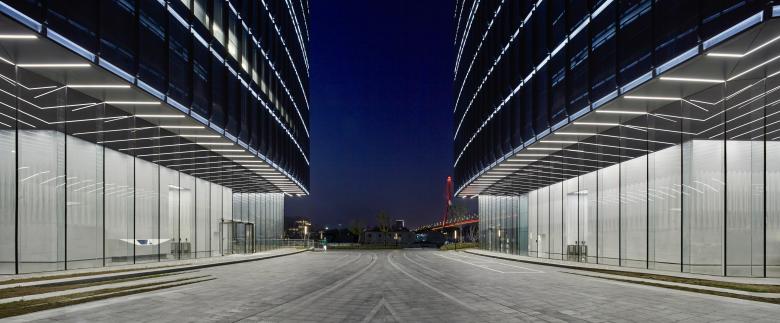
Next, a sense of unity was created by consistently using "LINE" elements in each part. The outer mullions of the curtain wall create many vertical lines on the elevation. We positioned these lines as "strong lines" and grouped other lines as "intermediate lines" or "weak lines.”
The line of lighting in the entrance hall is connected to the "strong line" in the outer mullion. The continuity of the lighting lines beyond the glass wall emphasized the volume of the "big black box.”
The 8.5-meter-high glass wall of the entrance hall is supported by a 300-mm-deep glass mullion and a 30-mm-wide structural seal at its edge. The repetition of minimalistic details created a highly transparent glass wall. These glass wall elements were positioned as the "intermediate lines.”
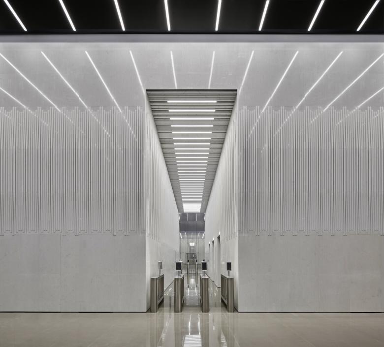
Finally, the surface layer of the "small white box" was covered with a "weak line”. The aim was to create a look that was at odds with the harshness of the cantilever structure borne by the "small white box.”
On the surface of the “small white box" covered with white marble, grooves were dug at a pitch of 30 mm to make it look as if over 2000 thin strips were gathered together to form a single white volume. The height of the middle part of the narrow strips changes in a wavy pattern, creating a fabric-like softness (like issei miyake's "pleats please"). This was intended to insert an organic element into the monotone, transparent entrance hall, and also to ease the tension of the office workers.
Related Projects
Magazine
-
Winners of the 5th Simon Architecture Prize
6 days ago
-
2024, The Year in …
1 week ago
-
Raising the (White) Bar
1 week ago
-
Architects Building Laws
1 week ago
